2 Exploring Data Visualisations in Baseball
Duration: 1 to 2 lessons
Objective: By the end of this lesson, students will be able to explore and interpret different types of data visualisations using real-world baseball statistics on Baseball Savant. They will learn how to identify relationships, comparisons, and trends using various visualisation types.
2.1 Materials Needed
- Internet-enabled devices (laptops or tablets)
- Access to the Baseball Savant visualisation page: https://baseballsavant.mlb.com/visuals
- A notebook for note-taking
- Reference image on common data visualisations (provided in OneNote)
2.2 Instructions
2.2.1 Part 1: Introduction to Data Visualisations (5 minutes)
Read the Introduction:
Data visualisations are powerful tools used to represent large sets of data in a visual format. In baseball and many other fields, visualisations help us understand performance, relationships between statistics, and trends over time. Today, we’ll explore different types of visualisations and their purposes before looking at real-world baseball data.Understand the Types of Visualisations:
Refer to the reference image on common data visualisations provided in your materials. For each of the following chart types, follow these steps: a) Find the chart type in the reference image b) Take a screenshot or sketch the example chart c) Write down the purpose (common use) of this chart Chart types to explore:
| Chart Type | Screenshot/Sketch | Purpose |
|---|---|---|
| Pie Chart | [Insert screenshot or sketch here] | Show -> Composition -> Static -> Simple share of total |
| Bar Chart | ||
| Line Chart | ||
| Scatter Plot | ||
| Bubble Chart | ||
| Stacked Area Chart | ||
| Your Choice 1 | ||
| Your Choice 2 |
Complete this process for each chart type listed above. This will help you understand the purpose and best use cases for different types of data visualisations.
2.2.2 Part 2a: Exploring Baseball Savant Visualisations
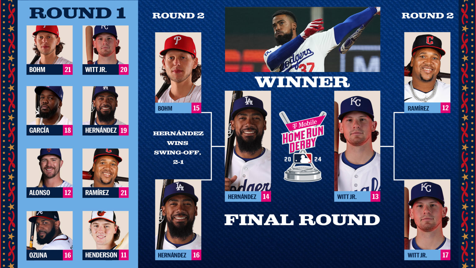
Source: https://www.mlb.com/news/2024-home-run-derby-results
Open Baseball Savant:
Go to https://baseballsavant.mlb.com/visuals. This page offers various types of data visualisations for real-time baseball statistics.Find a Similar Chart:
Explore the visualisations available on Baseball Savant and find one that is similar to any of the common chart types we discussed earlier (pie chart, bar chart, line chart, scatter plot, bubble chart, or stacked area chart).Take a Screenshot:
Capture a screenshot of the visualisation you’ve chosen from Baseball Savant.Compare and Contrast:
Create a table to compare the Baseball Savant visualisation with the common chart type it resembles. Use the following format:
| Aspect | Common Chart | Baseball Savant Chart |
|---|---|---|
| Chart Type | ||
| Data Displayed | ||
| Colour Usage | ||
| Interactivity | ||
| Additional Features |
- Analyse Differences:
Below your table, write a short paragraph (3-5 sentences) speculating on the reasons for any differences you observed. Consider factors such as:- The specific needs of baseball data analysis
- The benefits of interactive web-based visualisations
- The audience for Baseball Savant (e.g., analysts, fans, players)
- Save Your Work:
Ensure you save your screenshot, comparison table, and analysis in your notes or designated document.
Remember, the goal is to understand how real-world data visualisations might differ from standard chart types and why these differences might exist in the context of baseball analytics.
2.2.3 Part 2b: Analysing Baseball Data Visualisations
- Choose a Visualisation:
- On Baseball Savant, select a visualisation type that interests you.
- Tip: Start with “Home Run Derby”.
- Select Statistics:
- Choose two players to compare.
- Record the data and screenshot.
- Example: From the player head icons on the top, choose “Witt Jr”. Record the statistics:
2.2.3.1 Bobby Witt Jr.
Finals:
13 HRs Hardest: 110 MPH Longest: 457 ft. Avg. EV: 102.7 MPH Avg. Distance: 409 ft. Total Distance: 1.0 miles 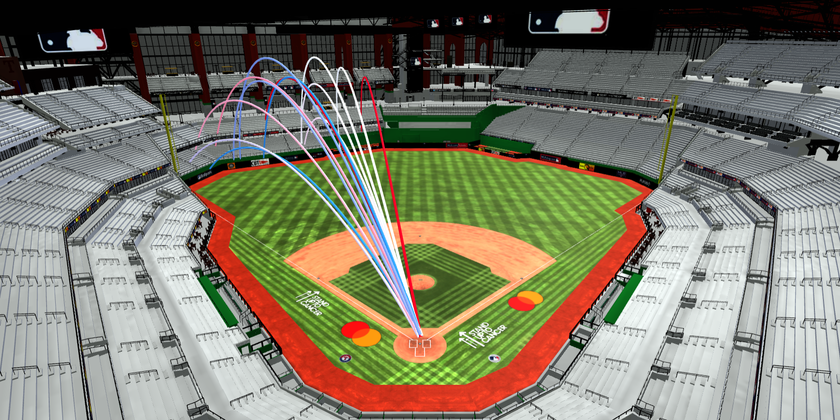
| Player | Round | HR # (Per Round) | Exit Velocity (MPH) | Distance (Ft.) | Launch Angle |
|---|---|---|---|---|---|
| Bobby Witt Jr. | Finals | 13 | 107 | 427 | 31° |
| Bobby Witt Jr. | Finals | 12 | 108 | 450 | 29° |
| Bobby Witt Jr. | Finals | 11 | 103 | 416 | 23° |
| Bobby Witt Jr. | Finals | 10 | 100 | 409 | 36° |
| Bobby Witt Jr. | Finals | 9 | 103 | 370 | 22° |
| Bobby Witt Jr. | Finals | 8 | 101 | 411 | 34° |
| Bobby Witt Jr. | Finals | 7 | 106 | 424 | 29° |
| Bobby Witt Jr. | Finals | 6 | 97 | 385 | 37° |
| Bobby Witt Jr. | Finals | 5 | 97 | 386 | 33° |
| Bobby Witt Jr. | Finals | 4 | 100 | 413 | 31° |
| Bobby Witt Jr. | Finals | 3 | 96 | 377 | 35° |
| Bobby Witt Jr. | Finals | 2 | 107 | 457 | 30° |
| Bobby Witt Jr. | Finals | 1 | 110 | 395 | 24° |
- Interpret The Visualisation:
- Spend 2-3 minutes examining the chart.
- Ask yourself: What does this visualisation tell me about player performance or the relationship between these statistics?
- Record Your Observations: Create a simple table in your notes:
| Visualisation Type | Statistics Compared | Key Observations |
|---|---|---|
| Scatter Plot | Exit Velocity vs. Launch Angle | 1. Higher launch angles often correspond with higher exit velocities. 2. … |
| … |
- Repeat the process for the second player.
Optionals:
- Choose a different visualisation type (e.g., Bar Chart, Heat Map).
- Select new statistics to explore.
- Interpret and record your observations in the table.
- Reflection Questions: Answer these questions in your notes:
- Which visualisation type did you find most helpful for understanding player performance? Why?
- How did the visualisations help you interpret relationships between different baseball statistics?
- Did you discover any surprising insights while exploring the data?
- Save Your Work:
- Ensure you’ve saved screenshots of at least two different visualisations you explored.
- Save your observation table and answers to the reflection questions.
Remember: The goal is to gain insights from the data visualisations. Don’t worry if you don’t understand every aspect of baseball statistics – focus on identifying patterns and relationships in the data.
2.2.4 Part 3: Group Discussion and Presentation
2.2.4.1 Group Work (10 minutes)
Form groups of 2-3 students. In your groups:
- Compare Visualisations (3 minutes):
- Each member shares their chosen visualisations.
- Discuss the similarities and differences in your choices.
- Discussion Questions (5 minutes): Compare your notes and discuss the following:
- Which visualisation type did each of you find most helpful for understanding player performance? Why?
- How did the visualisations help you interpret relationships between different baseball statistics?
- What surprising insights did you discover while exploring the data?
- How might these visualisations be useful for players, coaches, or analysts?
- Prepare Presentation (2 minutes): As a group, choose:
- One visualisation that you found most insightful or interesting.
- One key insight or finding from your exploration.
- One question or area you’d like to explore further.
2.2.4.2 Class Presentation (10 minutes)
Each group will have 2-3 minutes to present their findings to the class:
- Show the chosen visualisation (use a screenshot or recreate it quickly).
- Explain why you chose this visualisation and what makes it effective.
- Share your key insight or finding.
- Present your question or area for further exploration.
After each presentation, allow for 1-2 quick questions from the class.
2.2.4.3 Teacher Note
Encourage students to think critically about the visualisations and to consider how these tools might be used in real-world baseball analysis. Emphasise that there are no wrong answers - the goal is to learn from each other’s perspectives and insights.
2.2.5 Homework/Extension (Optional)
For those interested in diving deeper into baseball data visualisations:
- Home Run Derby Analysis:
- Select two players from a recent Home Run Derby (you can find past data on Baseball Savant).
- Collect and record their Home Run Derby statistics, similar to what we did in class.
- Create at least two different types of visualisations to compare these players’ performances. For example:
- A scatter plot comparing Exit Velocity and Distance for both players
- A bar chart comparing the number of home runs hit by each player in different rounds
- Visualisation Comparison:
- For each visualisation you create, write a short paragraph (3-4 sentences) explaining:
- Why you chose this type of visualisation
- What insights it provides about the players’ performances
- How it compares to the Baseball Savant visualisation of the same data
- For each visualisation you create, write a short paragraph (3-4 sentences) explaining:
- Player Performance Analysis:
- Based on your visualisations and the data you’ve collected, write a brief analysis (200-300 words) comparing the two players’ Home Run Derby performances.
- In your analysis, consider factors such as:
- Consistency (e.g., variation in Exit Velocity or Launch Angle)
- Power (e.g., average Distance or Exit Velocity)
- Endurance (e.g., performance across rounds)
- Reflection:
- Write a short reflection (100-150 words) on:
- What you learned from creating your own visualisations
- How this exercise changed or enhanced your understanding of baseball statistics
- One way you think these visualisations could be useful for players, coaches, or analysts
- Write a short reflection (100-150 words) on:
- Presentation:
- Prepare a brief (2-3 minute) presentation of your findings, which you may be asked to share in the next class.
- Include your visualisations, key insights, and any questions that arose during your analysis.
Remember to save all your work, including screenshots of your visualisations, your written analysis, and your reflection. Be prepared to discuss your findings and experiences in the next class.